 Book a call →
We Know What Tomorrow Brings: Design Trends 2026 as a Revolt Against the Machine
Design has always been a mirror. In 2026 that mirror shows something surprising: people who have had enough of flawlessness.
trends are answers
the starting pointThere is a misunderstanding about how design trends come about. People picture creatives waking up in the morning and deciding that this year everything will be wavy and loudly coloured.
In truth it works the other way round: trends are not inventions but answers. They react to what came before — and above all to what people feel without saying it out loud.
In 2026 the answer is particularly clear. After years of flawless grids, smooth gradients and interchangeable perfection, the pendulum is swinging back. And the trigger has a name nobody would have expected in a design briefing three years ago: artificial intelligence. Because now that machines turn out faultless visuals in seconds, the faultless has suddenly become the cheapest thing there is. And people do what they always do when something is available in abundance: they want the opposite.
imperfection as luxury
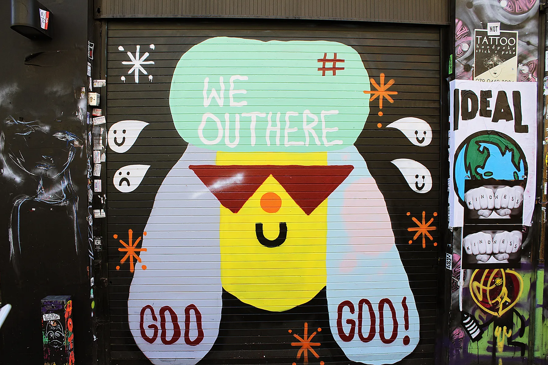
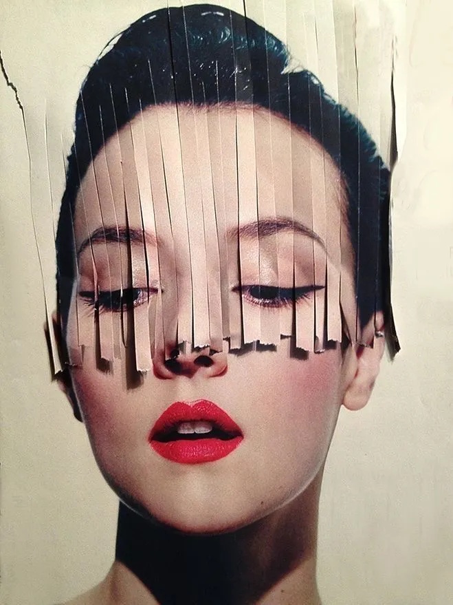
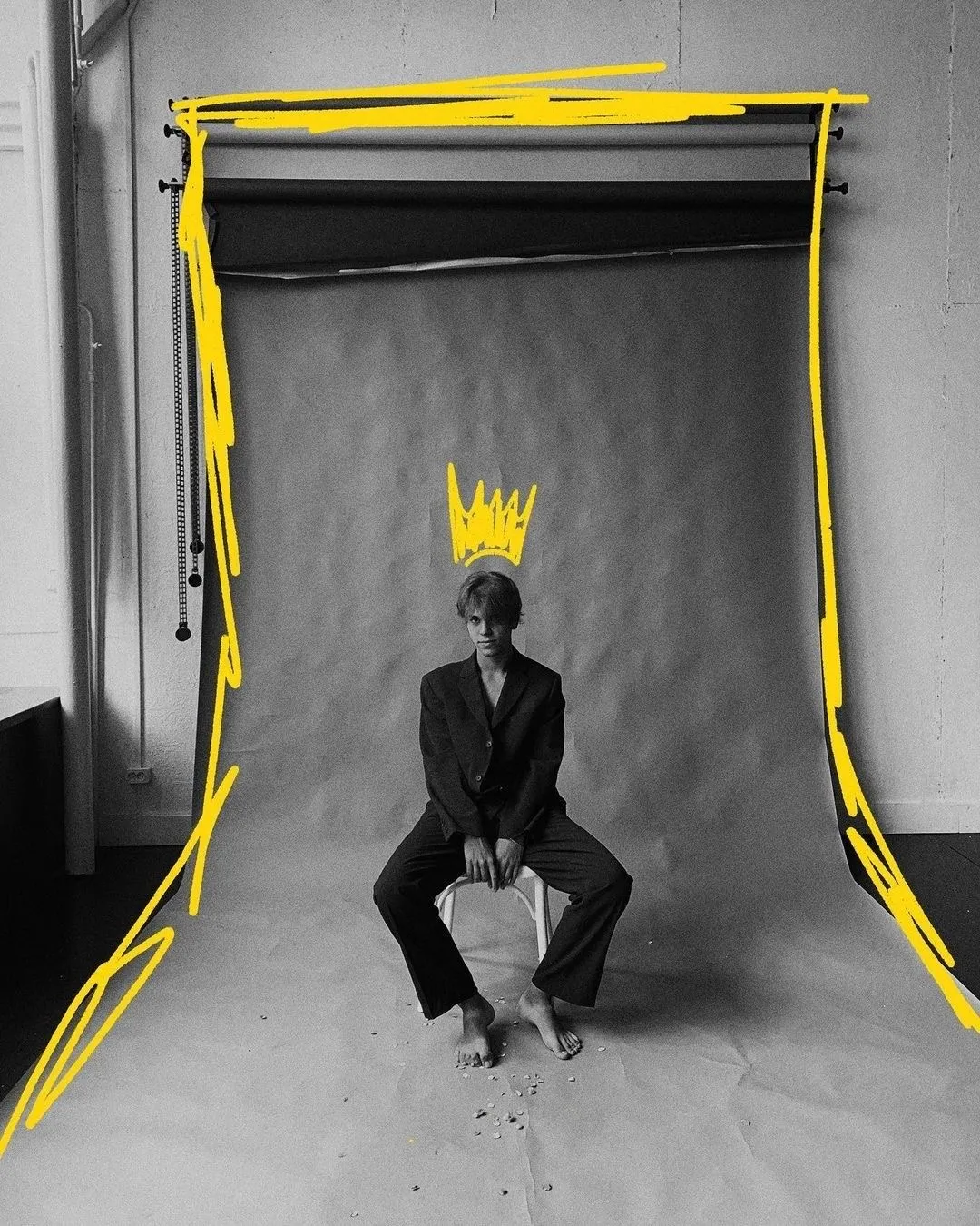
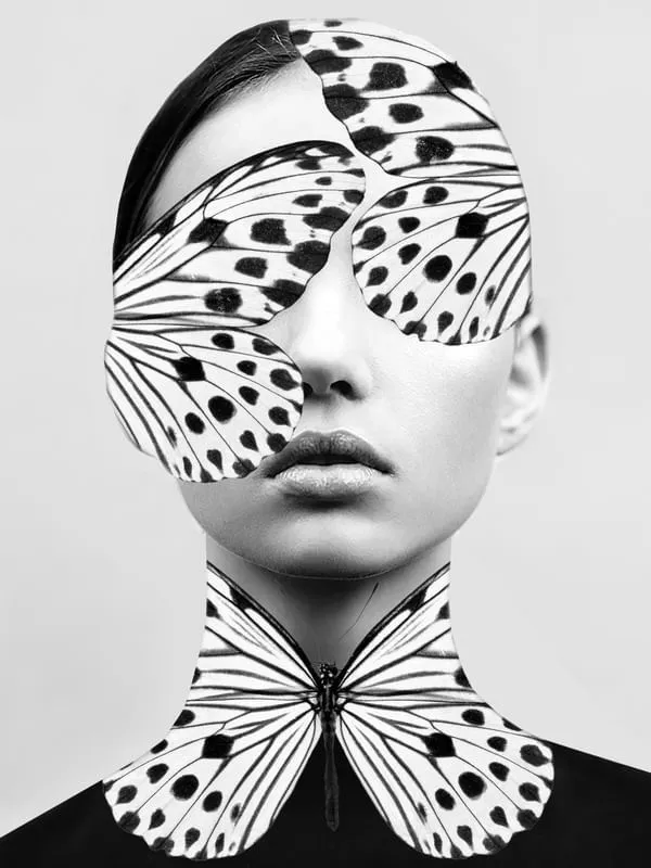
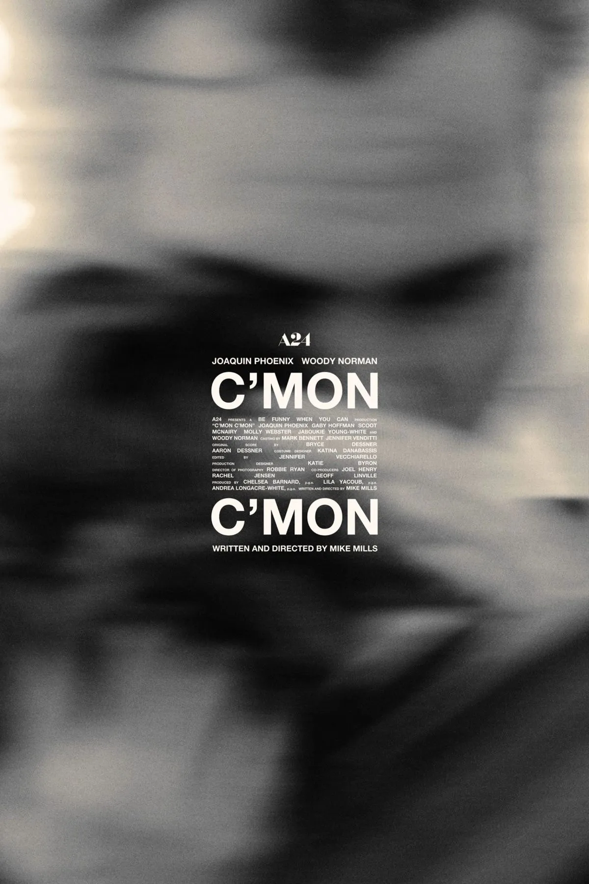
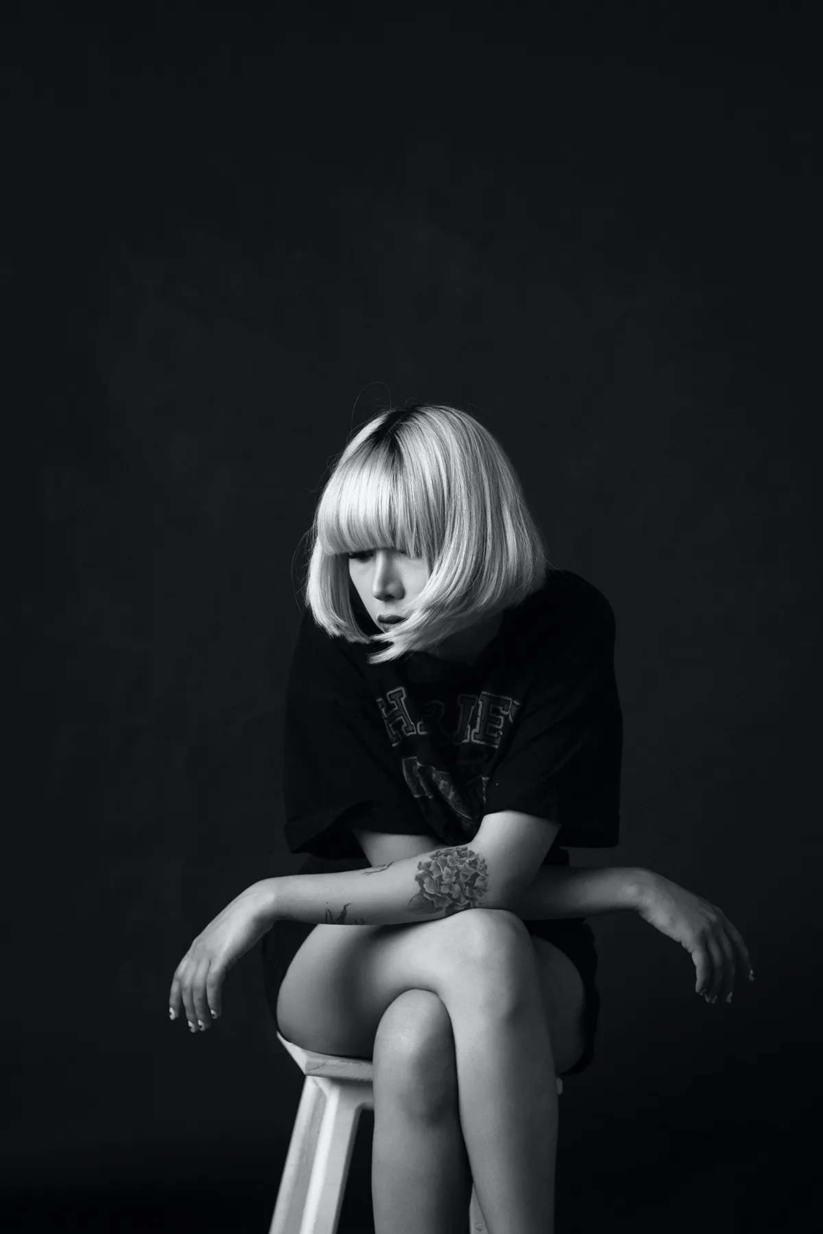
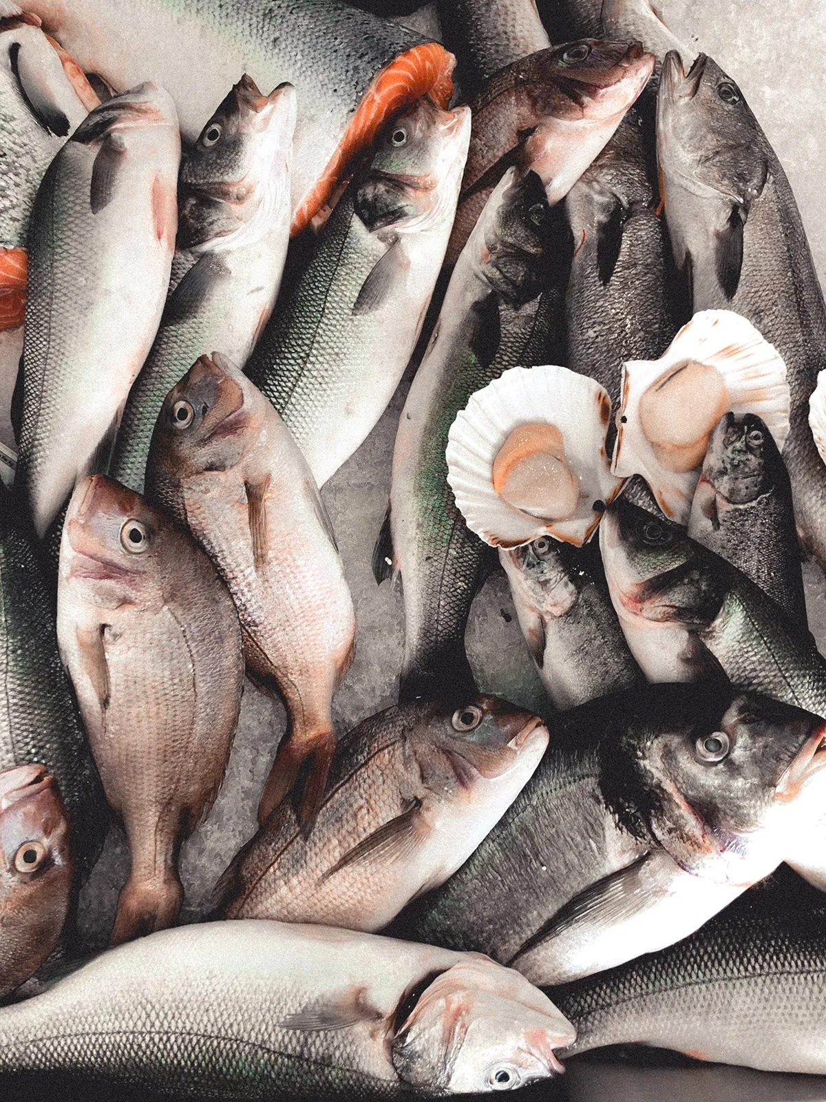
human touchPerhaps the biggest movement of the year is a paradox: design is deliberately becoming imperfect. Hand-drawn lines, visible brushstrokes, grainy textures, collages that look like they came out of a nineties zine. What used to count as a beginner's mistake is a statement today.
The reason is as simple as it is profound: in a world where AI generates perfect images in seconds, imperfection becomes proof that a person was at work. Handmade texture signals what no algorithm can deliver — a decision, a signature, an intention.
In an era when machines produce flawless images in seconds, imperfection becomes the new luxury — the proof that a human made it.
The nuance matters: this imperfection is not sloppy. It is staged. The coarse grain, the crooked line, the collage of pasted-together elements — all of it placed deliberately to create warmth and credibility. In 2026 authenticity is not an accident but a craft. What looks real is usually carefully composed.
typography that shouts
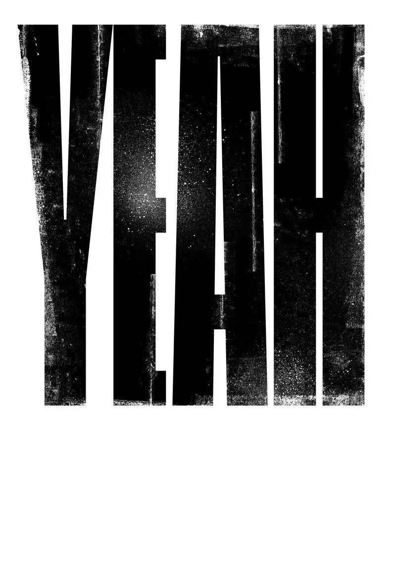
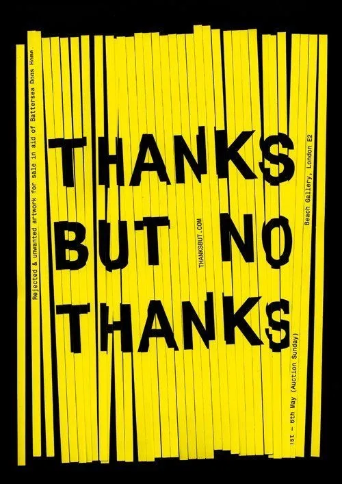
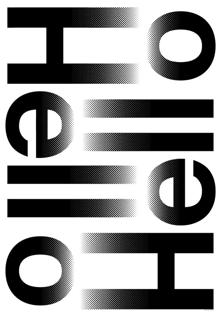
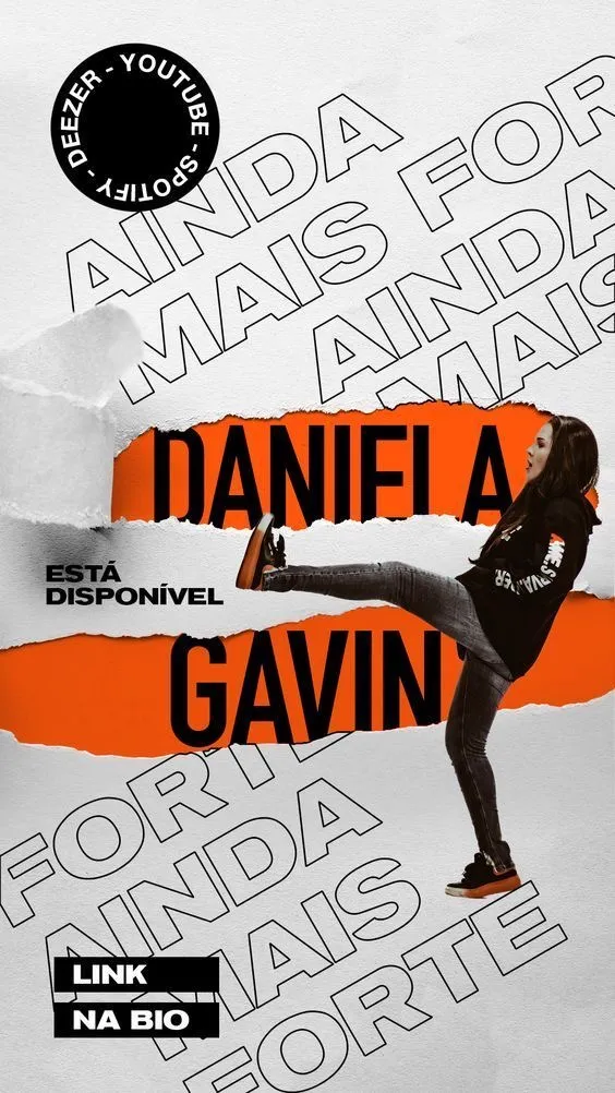
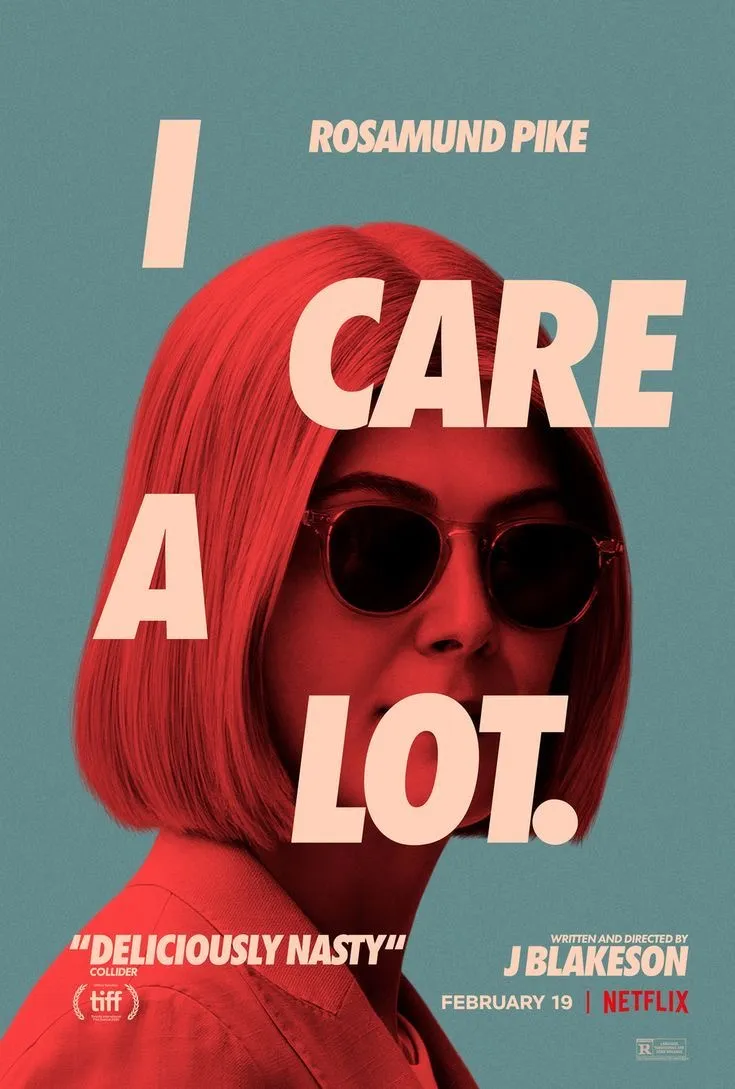
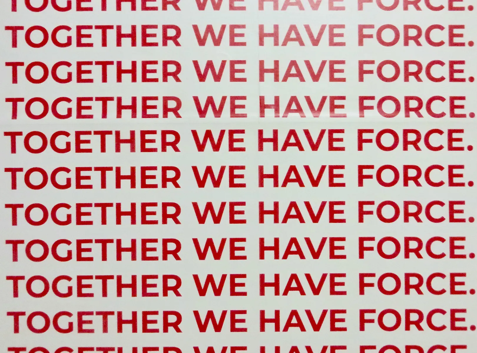
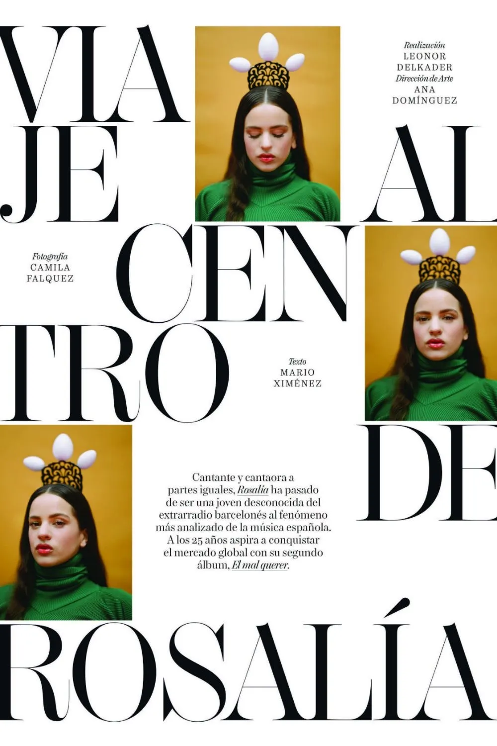
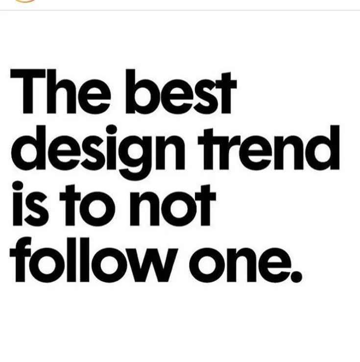
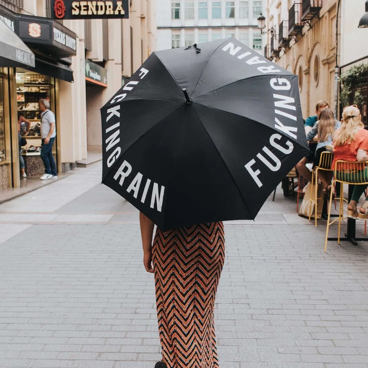
the last identityNo element has made a bigger leap in 2026 than type. Typography has gone from supporting role to lead. Oversized sans serifs that fill the whole screen. Distorted, wavy display fonts that are closer to illustration than to text. Hand-lettered words that carry personality rather than merely decorating. Letters that stretch, bend and move.
There is a strategic logic behind it, and it is the most important insight for any brand: in an environment where images appear at the push of a button, a distinctive typeface is one of the last defensible forms of identity. A colour scheme can be copied and a layout grid rebuilt — but a typographic voice of your own belongs to the brand in a way that is not so easily stolen. That is exactly why brands are investing in custom and variable fonts again in 2026.
maximalism with attitude
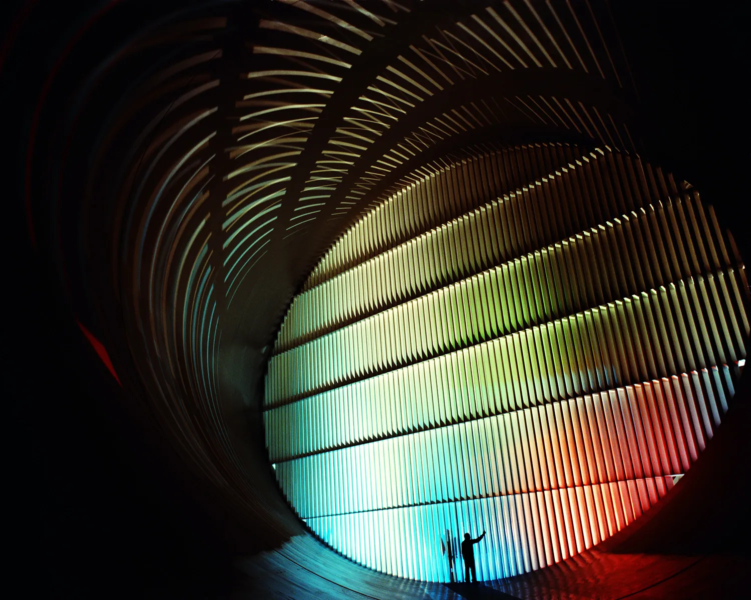
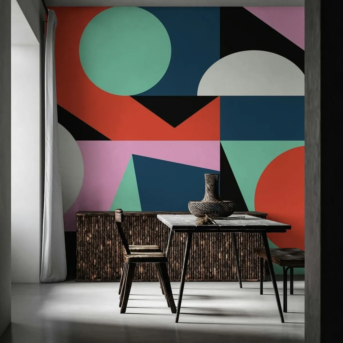
against playing safeMinimalism is not dead, but it has serious competition. Against the endless repetition of clean, safe layouts, 2026 sets maximalism: layered collages, colliding patterns, five colours instead of two, elements breaking out of their frame. Where minimalism whispers, maximalism calls out — and looks good doing it.
What drives it is the scarcity of attention. In an endlessly scrolling feed where everything looks polished, visual noise becomes the break in the pattern that stops the thumb. But — and this is the difference between good and bad maximalism — the abundance is never chaos. The strongest maximalism has an invisible order, a clear hierarchy beneath the surface. Rich, not confused.
The anti-design movement that David Carson set against the sterile perfection of minimalism in the nineties is making its comeback here — only with today's tools. Tellingly, even established studios such as Pentagram now play with a dual approach: minimalist layouts loaded with maximalist detail, awkward type on a calm ground. Thinking in either/or is giving way to both/and.
back to the future
and back to natureRetro-futurism
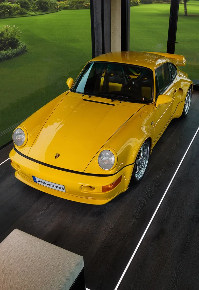
It mixes the analogue warmth of past decades with digital precision — chrome gradients and metallic textures meet muted neons that look as though they came out of a sixties diner. Progress here does not mean forgetting but reinterpreting.
Nature-inspired design
Organic shapes, earthy palettes, tactile textures that convey honesty and balance. Not as a heavy-handed sustainability symbol but as atmosphere — a counterweight to the synthetic smoothness of the digital world.
Blueprint Design
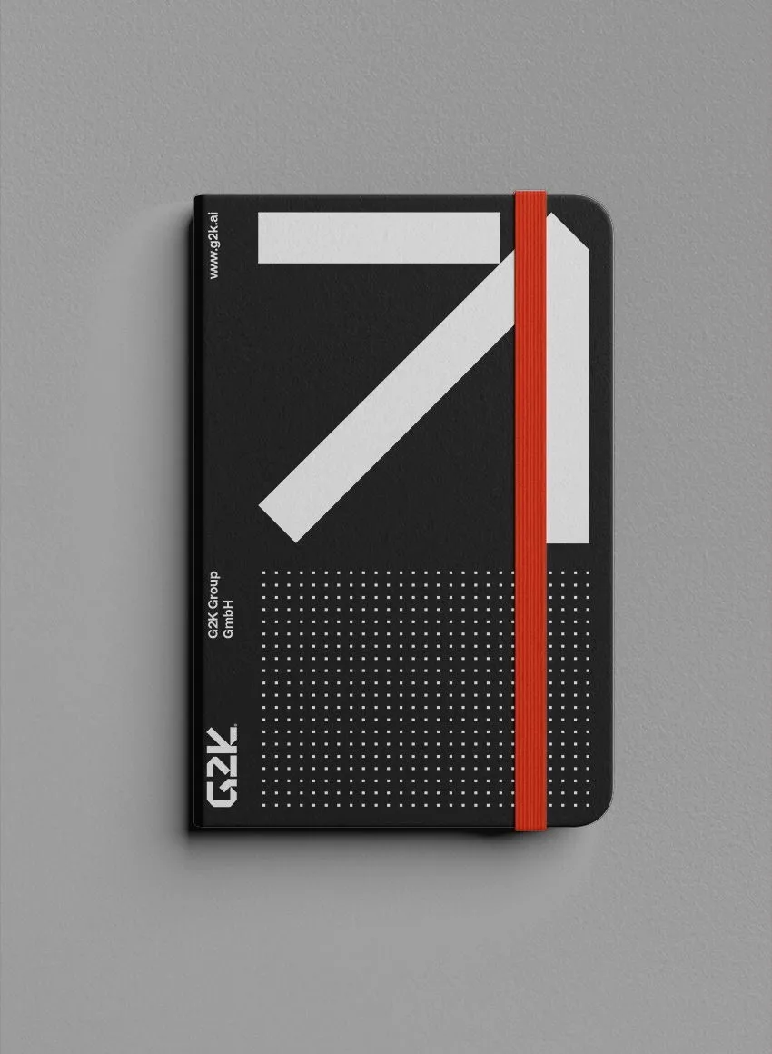
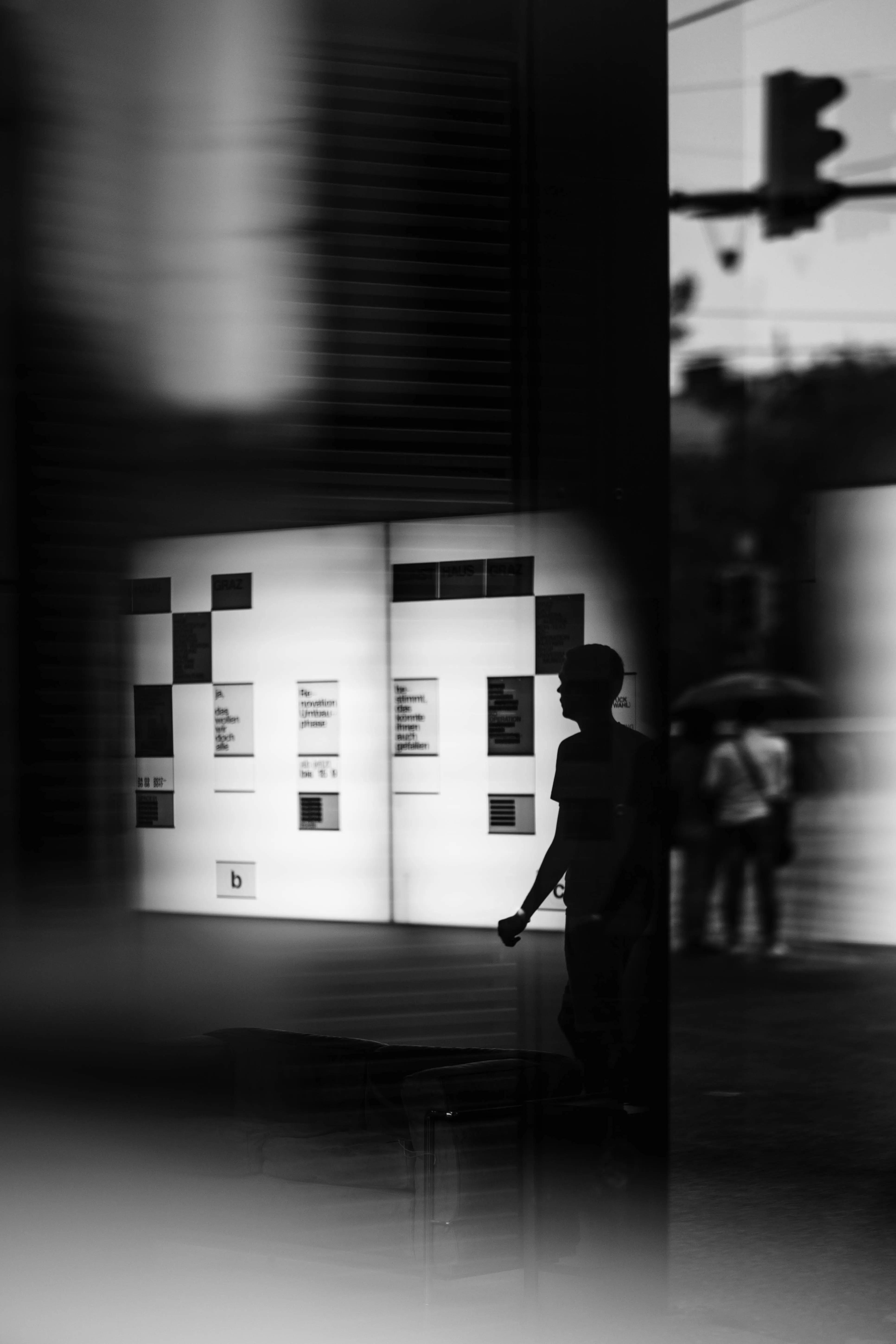
Between the two sits a third, almost poetic trend: it turns the language of technical drawings — dimensions, arrows, exploded views — into a graphic game and raises structure itself to a style. Order as aesthetic, process as beauty.
design with a message
conclusionWhat connects all these currents is an ambition that goes beyond appearance. In 2026 graphic design is increasingly becoming a platform for taking a position.
On subjects such as social justice, climate and diversity. Good design no longer wants only to please, it wants to move something. The thread running through all these trends — imperfection, expressive type, maximalism, craft — is not aesthetic in nature. It is cultural. All four express the same desire: for visual work with a genuine point of view. For something a person decided rather than a model calculated.
For brands that means the biggest mistake is not the wrong trend but playing safe. Anyone hiding behind smooth templates disappears into the noise of the machines. The trick is not to take up every trend but to recognise which of them expresses a deeper cultural shift — and will therefore last — and which remains a surface phenomenon.
The brands that break through in 2026 are not the ones with the safest designs — but the ones with the boldest point of view.
Because design remains what it always was: the most accurate mirror of its time. And in 2026 that mirror shows a world that has had enough of the perfect and is looking for the human again. Anyone who understands that is not just shaping the next trend. They are shaping the shift. And yes — we do know a little of what tomorrow brings.
Sources
- 01Digital Synopsis (2026): “Top 20 Graphic Design Trends For 2026” — AI as collaborator, elastic typography, neo-brutalism.
- 02Young Mind Interactive (2026): “Graphic Design Trends 2026 — What's Shaping Visual Communication” — typography as defensible identity.
- 03Krumzi (2026): “12 Graphic Design Trends 2026 (With Real Examples)” — maximalism, mixed media, dopamine design.
- 04Kittl Blog (2026): “10 Graphic Design Trends 2026” — blueprint design, type collage, grainy blur.
- 05Zeka Design (2026): “11 Graphic Design Trends 2026” — painted design, punk revival, the human-touch movement.
- 06Envato Elements (2026): “Graphic Design Trends 2026 — 8 Styles” — dual aesthetics (Pentagram), chaos packaging, David Carson and anti-design.
- 07Jukebox Print (2026): “20 of the Biggest Graphic Design Trends for 2026” — retro-futurism, illustration as a human signature.
courage instead of a template?
We design with a signature rather than a template — and work out which trend genuinely suits your brand.