 Book a call →
monospaced fonts
Every letter the same width, every gap calculated: what was once a technical necessity is now a statement — and says more about our times than it first appears.
the return
originsSome typefaces never quite disappear. They fall out of fashion, wait a few decades in typography's toolbox and then resurface — carrying a meaning they never originally had.
The origin is soberly technical: the typewriter had no choice. Every mechanical type needed the same advance, so every character got the same width — the narrow “i” as much room as the wide “m”. Programmers later adopted the principle, because code, figures and columns of data simply read better in even columns. For decades, monospace was the typeface of machines. Functional, invisible, unglamorous.
Which makes where it turns up today all the more surprising: on product packaging, in editorials, on start-up websites, in the corporate design of entire brands. What once smelled of terminals and punch cards suddenly stands for elegance. How did that happen?
order you can feel
the formBecause every character takes up exactly the same space, a visual rhythm emerges that needs no explanation — you feel it. The text gains a grid, an internal architecture, a calm severity. For minimalist layouts, technical applications and clearly defined brand identities, that is worth its weight in gold.
This order communicates something before a single word has been read. Monospace signals structure and systematic thinking — no wonder the visual language resonates so deeply with tech brands and start-ups. Typographers describe the effect neatly: a monospaced typeface reads like a handwritten note. It suggests intent.
Monospace never looks incidental. Every equal-width cell reads like a decision — and it is exactly that perceptible intent that makes it so valuable to brands.
Then there is the double character that makes monospace so versatile: it is nostalgic and forward-looking at once. The even characters summon old typewriters, telex machines, the early days of the computer — and yet stand for pared-back, modern design. That tension between retro and reduction is the sweet spot for any brand looking to place itself between tradition and innovation.
from code editor to packaging
in useFor a long time monospace lived almost exclusively where it was needed: in the code editor, in the dashboard, in data-driven interfaces where numbers stack up in clean columns and every value sits in its fixed position. It has never left that functional home — it has simply widened it.
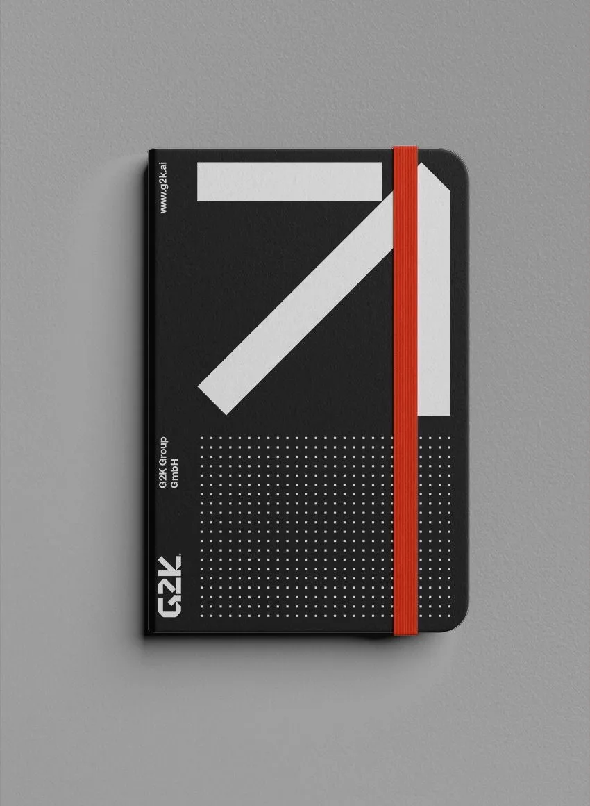
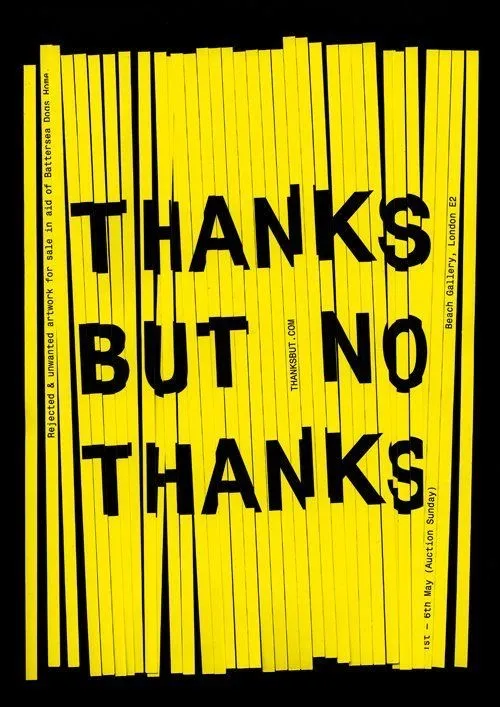
Today the same aesthetic is moving into branding. Brands that see themselves as precise, technological or disruptive use monospace to carry exactly that attitude. In packaging it stands for quality through reduction: the clean lines suit premium packs and limited editions perfectly. And in experimental projects the geometric severity becomes a canvas for animated type and interactive interfaces.
The contemporary type landscape supplies the evidence. Space Grotesk, with its monospace heritage, has become a darling of the tech aesthetic; families like Neue Machina, Antarctican Mono or DX Rigraf carry the technical character deliberately into corporate design. These are not typewriter copies but new designs that translate the spirit of monospace into a modern visual language.
the real reason
the machineThat monospace is returning right now has a deeper trigger than nostalgia. It is the same force preoccupying the whole design world in 2026: artificial intelligence.
In an age where algorithms spit out flawless images and smooth layouts in seconds, the value of perfection shifts. The fault-free has become cheap; the human becomes the differentiator. Typographers talk about visible human work becoming the decisive marker of the year — in direct collision with what critics bluntly call “AI slop”.
Monospace fits that need like almost no other typeface. It looks like system, like craft, like a conscious decision — like a human who set rules rather than a model calculating probabilities. Consider the magazine “Hammer & Hope”, whose bespoke monospaced typeface, with its precise half-spaces, produces a mechanical roughness: half tool, half manifesto.
The more the machine takes over the perfect, the harder the eye looks for traces of the human. Monospace carries that trace in every equal-width cell.
The culture critic Kyle Chayka described in “Filterworld” how algorithms flatten culture into a uniform mush. Against that backdrop, the return of monospace is almost a quiet act of resistance: a typeface that treats order not as conformity but as character.
severity as signature
takeawayThe finest twist in monospace is its built-in contradiction, which good design turns into strength. At first glance it seems rigid, mathematical, impersonal. And yet it is precisely that severity that produces an unmistakable personality. The sameness of the characters becomes the signature.
For brands that means monospace is not a neutral building block but a statement. Choosing it says something about you — about precision, about technical competence, about the nerve to forgo decorative warmth and go for a clean edge instead. In a field where interchangeable sans serifs are the norm, that is a competitive advantage. A typographic voice of your own belongs to a brand in a way that cannot be copied as easily as a colour scheme.
Monospace is therefore far more than a nostalgic bow to the typewriter. It is a tool for anyone who wants to bring clarity, structure and attitude into their design — and who has understood that in the age of machines, the human becomes the luxury. It is, with good reason, the new black.
Sources
- 01AND Academy (2026): “11 Typography Trends to Follow in 2026” — monospace as a signal of order and systematic thinking.
- 02PRINT Magazine (2026): “2026 Type Report” — the human hand as a marker against “AI slop”, Hammer & Hope custom monospace, Fran Sans.
- 03Fontfabric (2026): “Top 10 Design & Typography Trends for 2026” — monospace in zine and DIY brand systems, strategic imperfection.
- 04Creative Boom (2025): “50 fonts that will be popular with designers in 2025” — Neue Machina and the monospace machine aesthetic.
- 05FreeLogoServices (2025): “50 Best Fonts for Designers” — Space Grotesk, Antarctican Mono, DX Rigraf for tech branding.
- 06Monotype: “Type Trends — Re:Vision” — typography between technology, environment and culture.
- 07Kyle Chayka: “Filterworld — How Algorithms Flattened Culture” — cultural uniformity as the context for the monospace revival.
a voice of your own?
A colour scheme can be copied; a typographic voice cannot. We build type systems that belong to your brand.