 Book a call →
design &
concept
Design is more than aesthetics — it is a strategic process. We develop concepts that do not just look good but carry a clear message.
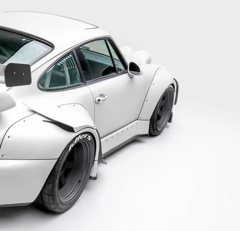
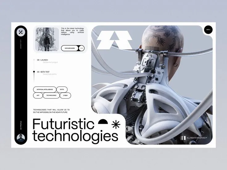
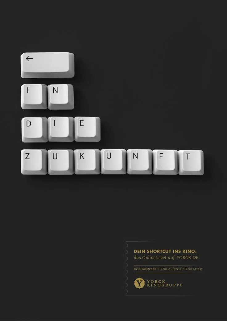
four areas.
Instead of one long list, we have sorted the 12 services by medium — from brand identity through print and product to the digital side. Jump straight to whatever interests you.
brand identity
The visual foundation of a brand. Visual identity, the mark and the typographic system behind it.
3 services 02print & space
Design you can hold and walk through. Publications, packaging and the spaces where brands happen.
3 services 03product
When the object itself is designed. From how it is used through its form to series production.
2 services 04digital & advertising
Design for screens and campaigns. Interfaces, movement and advertising with a clear message.
4 servicesbrand identity
3 servicesThe visual foundation — what makes a brand distinguishable from every other one.
01 corporate design
A visual identity that holds up creates recognition and distinction — across every channel.
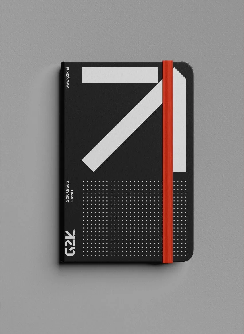
From the logo through stationery to the trade fair stand and digital media, we develop coherent brand worlds. What counts is not the single handsome design but the system behind it, the one that still works in five years.
02 logo design
The logo is the visual anchor. Wordmark, symbol or a combination — we design marks that stay usable in every situation.
The process considers not only the aesthetics but the scaling: a logo has to work on the letterhead as well as it does as a tiny symbol in a browser tab or in single-colour embossing.
03 typography
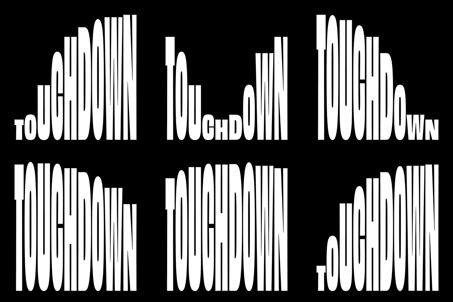
Type is not a detail but the tone in which a brand speaks. We select the families, fix the size relationships and spacing and document them in a system anyone can follow.
A considered typographic grid often does more for recognition than the logo — because it is visible on every page and not just in the corner.
That includes sorting out the licences: typefaces are licensed, and the terms for web, print and app differ. We tell you what that costs up front.
print & space
3 servicesDesign you hold in your hand or walk through.
01 editorial design
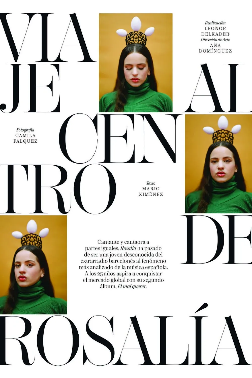
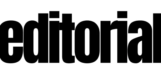
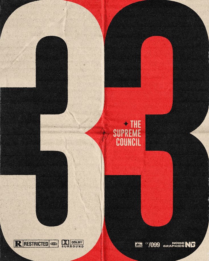
Magazines, catalogues, annual reports, brochures. Good editorial design ties together structure, readability and a rhythm of its own.
We work with typography, an image concept and layout rules that still hold when the editorial team carries on by itself later.
Separate page: Editorial design is a focus of its own for us — from grid and type system through magazines and reports to supervision on press. To the full overview →
02 packaging design
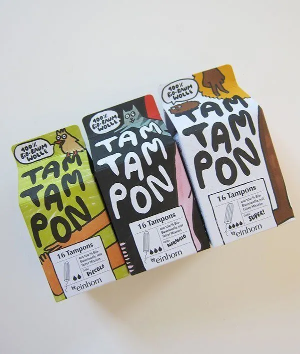
Packaging is often the first physical contact with a product and helps decide the purchase.
We design solutions where function and appearance fit together — with an eye on materials, folding systems and the feel of it. We use sustainable materials where they hold up technically and are not merely claimed on the label.
03 trade fair design
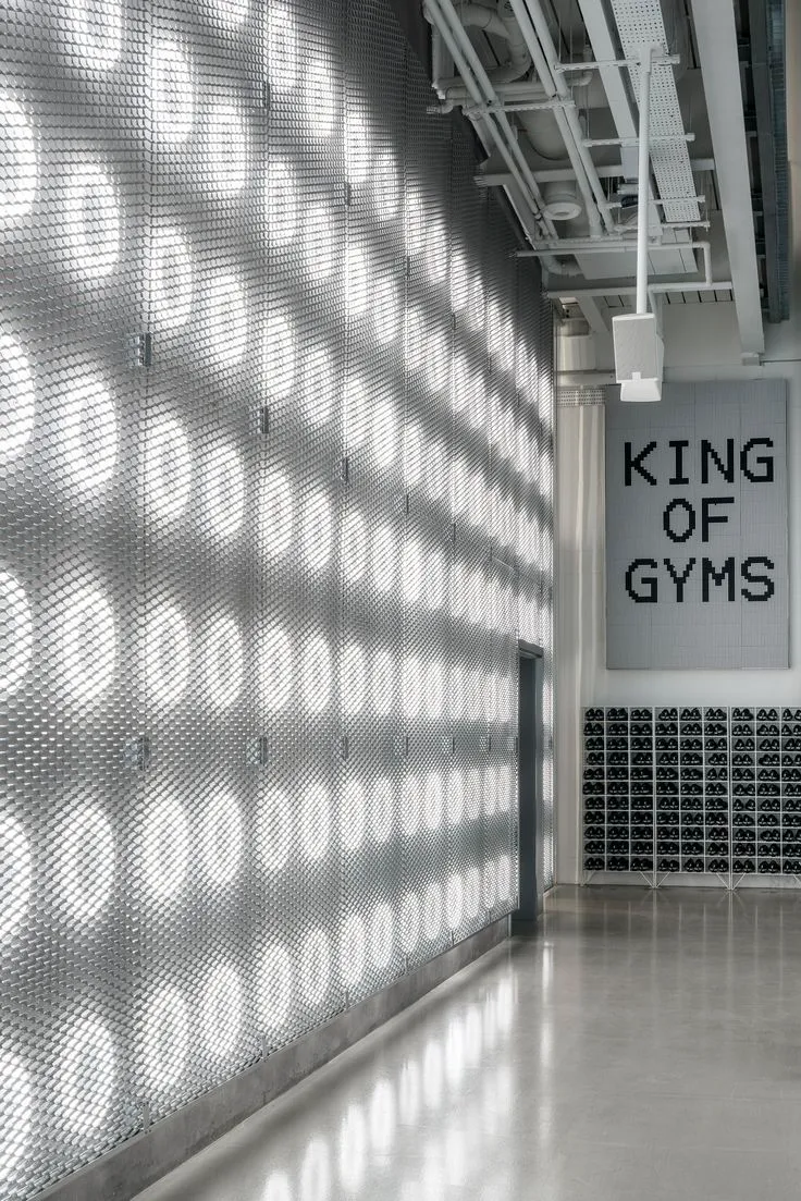
Trade fairs are brand worlds you can walk into. We design stands through the use of space, visitor flow and interactive elements.
The most common mistake is wanting to show everything. A stand that makes one thing clear stays with people better than one that squeezes in twelve messages.
product
2 servicesWhen it is not the communication being designed but the object itself.
01 product design
Product design covers more than the outer form — it is about the whole of how something is used. A product has to work, fit sensibly into everyday life and still set something off.
We look at what the market needs, take manufacturing into account and develop solutions that hold up both as design and commercially — from the idea to the production run.
02 industrial design
Industrial design ties engineering to design, function to commercial sense.
We develop solutions that respect the production process, use material efficiently and are built to last — from machines and devices to consumer goods.
That takes an understanding of manufacturing technique and ergonomics. Where specialist expertise is needed, we work with engineering and production rather than claiming it ourselves.
digital & advertising
4 servicesDesign for screens, movement and campaigns.
01 digital & ui/ux design
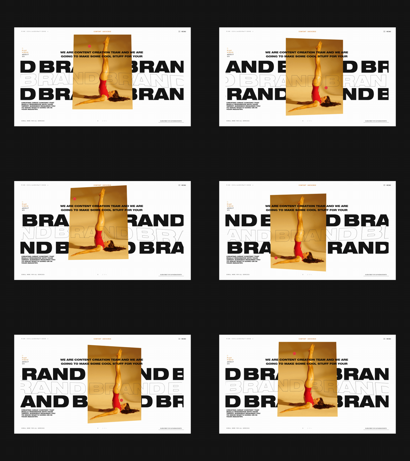
On screen, usability counts as much as appearance. We design interfaces for websites, applications and interactive platforms.
UX settles how something works, UI how it looks. The two belong together — a handsome interface nobody can operate has failed.
02 motion design
Design does not have to stand still. Animated logos, moving web elements or explanatory formats create attention and show processes that are hard to convey statically.
Used sparingly, movement works. Used everywhere, it turns into noise.
03 advertising & ads
From the conventional print advertisement to the digital banner. We develop advertising with strong imagery and a clear message.
The challenge is the same everywhere: within seconds it has to be clear what this is about and why it concerns anyone.
04 advertorial design
Advertorials combine editorial form with commercial intent and present offers in a high-quality setting.
We design them so that they genuinely offer something rather than merely looking like an article.
Note: Advertorials have to be labelled — they must be recognisable as advertising. That is not a formality: undisclosed advertising is legally actionable and damages exactly the trust the piece was meant to build.
goes with this.
Most projects connect to at least one of these disciplines.
project in mind?
Whether it's a single mark or a complete identity — it starts with the question of what the brand should stand for.